Explanation of Receiver Operating Characteristic (ROC) Curves
Introduction - Diagnostic Tests on a Continuum
In our entries at GetTheDiagnosis.org, we always refer to the sensitivity and specificity of tests for a particular diagnosis. This assumes that a test can have a "positive" and "negative" result. In reality, though, test results lie along a continuum. For example, the values of Fasting blood glucose can range from 50 mg/dl to >250 mg/dl; we may choose 110 mg/dl as our cutoff or threshold for a "positive" test - but clearly we can choose other values. As another example, the American College of Rheumatology has developed diagnostic criteria for the diagnosis of Systemic Lupus Erythematosis; these criteria are a list of findings, and a person is considered to have SLE if they have at least 4 out of 11. One can imagine that lowering the threshold will accept more patients as positive (having SLE) - but lead to greater false positives. Similarly, raising the threshold to, say, 5/11 will yield fewer positives, but there will be fewer false positives as well. Even physical exam findings and imaging diagnoses are made on a continuum, and we have to understand how that impacts the diagnoses we make - and what thresholds we should choose.
The ROC Graph
We can represent the effects of changing our threshold graphically by using a receiver operating characteristic, or ROC, curve. These graphs were initially developed for radar engineering but have found wide use in statistics for their ability to display this type of information. The ROC graph plots sensitivity on the y-axis and (1-specificity) on the x-axis. We put a point on the graph for each threshold value of the test, plotting the sensitivity and specificity of the test at that value. Connecting those points creates a curve - the ROC curve.
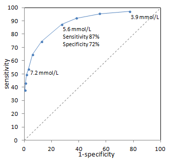
Example ROC curve from (Bortheiry AL, et al. Diabetes Care 1994 PMID 7821166) for diagnosis of diabetes based on fasting blood glucose. Sensitivity and specificity for a single point (5.6 mmol/L) are highlighted. The dashed line represents a non-discriminatory test (see below).
ROC curves tend to go from the bottom left corner to the top right corner of the box. This represents the intuitive trade-off between sensitivity (rising as we move up) and specificity (dropping as we move right). Points in the lower left are thresholds of the test where we are very specific but not very sensitive; in the example above, this is a high threshold for fasting blood glucose. Points in the upper right are thresholds of the test where we are very sensitive but poorly specific. Using a low threshold for fasting blood glucose, we pick up a large fraction of diabetics but also many healthy patients.
There are several places on the ROC graph that have special significance. The first is an imaginary diagonal line from the bottom left to the top right corners. This line represents points where sensitivity = 1-specificity. You may recall from the definition of the Positive Likelihood Ratio that PLR = sensitivity/(1-specificity). Therefore, along this diagonal line, PLR is 1! In other words, a test with points on this line is completely useless - non-diagnostic.
The top left corner of the ROC box is the point where sensitivity = 100% and specificity = 100% (1-specificity = 0%). This represents a perfect test. The closer the ROC curve get to the top left corner, the better the test is overall. The closer the curve comes to the center diagonal line, the worse the test. When it comes to picking a threshold to use in practice, we often try to pick a point closest to the top left corner - the closest to perfect. However, you might imagine situations where greater sensitivity or specificity may be desired with a trade-off of worse specificity or sensitivity, respectively. The curve allows you to tune your diagnostic parameters.
You might wonder about the bottom right part of the ROC box, below the diagonal line. This represents tests where PLR < 1, in other words where the test rules against the diagnosis. This simply means that your test "positive" and "negative" are defined in the opposite way (i.e. a positive test makes the disease unlikely).
Area Under the ROC Curve
Besides showing us how thresholds affect test performance, ROC curves can allow us to compare different tests. As we have alluded to earlier, the closer the ROC curve reaches to the top left corner, the better the test.
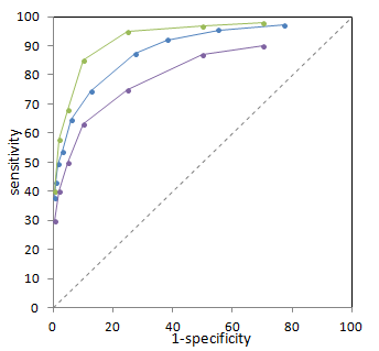
Illustration of 3 different ROC curves from imaginary data. The green test is best, and the purple test is worst.
We can quantify how well each test performs by finding the area under the ROC curve (using integration). This allows us to quantitatively compare different tests (and even perform statistical hypothesis testing to determine if there is a statistically significant difference between two tests). Note that this comparison does not require us to determine a threshold in advance - we are in fact comparing the entire test, not just one specific threshold.
The closer a curve lies to the top left corner, the greater the area underneath it. Thus, a larger area under the ROC curve implies a better test. Interestingly, the area under the ROC curve has a direct meaning as well. It turns out that this represents the probability that the test will correctly distinguish one normal subject from one abnormal subject - in other words, it reflects the degree of overlap between normal and abnormal values for the test. You can see an interactive visual demonstration of this in the Sensitivity and Specificity article.
ROC Curves for Subjective Tests
Thus far, our examples have focused on quantitative tests such as fasting blood glucose. However, many of the 'tests' we perform in medicine are qualitative. These would include 'clinical diagnosis,' auscultation for murmurs, and interpretation of imaging. For these tests, we have to not only account for the performance of the test equipment (e.g. stethoscope, CT scanner) but also for the observer - the physician - carrying out the test. Medical students obviously cannot hear murmurs as well as internal medicine residents, who are probably still not as good as board-certified cardiologists. Similarly, different radiologists - even of the same training level - may have different abilities to distinguish normal from abnormal mammograms.
In order to use an ROC curve for our subjective test, we need to create a quantifiable measure. Typically, a 5-point scale is used. For example, in mammography, the American College of Radiology developed BI-RADS, which is a set of rules to classify findings on mammograms from benign to malignant - and gradations of certainty in between. A higher score on the scale will correspond to a greater certainty of malignancy.
Each observer will score cases differently. Thus, we can create an ROC curve for each observer, matching their certainty of malignancy (for example) with the actual outcome. As with quantitative tests, those observers with curves closer to the top left are better discriminators between normal and abnormal - healthy and diseased. Interestingly, within each curve - i.e. for each individual - there is room to move between more and less sensitive (thus less and more specific). We can see this being done in practice if we examine how physicians approach patients with different pre-test probabilities. For example, in patients with strong family histories of breast cancer, many radiologists would err on the side of greater sensitivity and lower specificity when interpreting mammograms (thus, the right part of the ROC curve).
References
Hanley JA, McNeil BJ. "The meaning and use of the area under a receiver operating characteristic (ROC) curve." Radiology 1982 Apr;143(1):29-36.